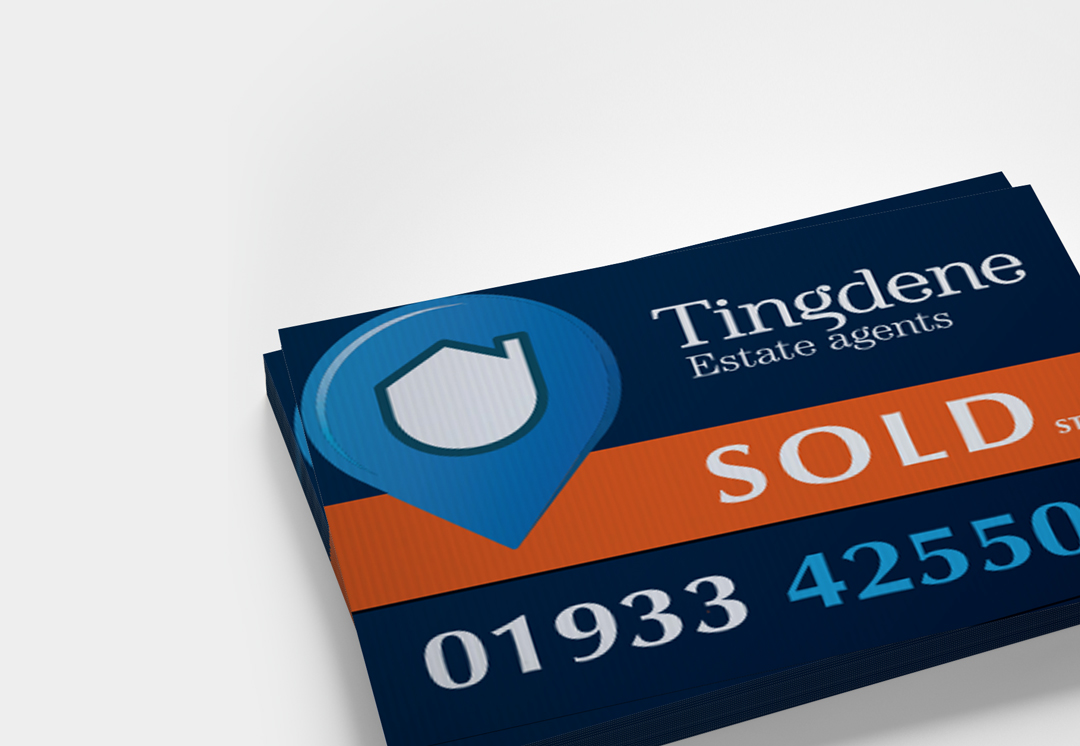
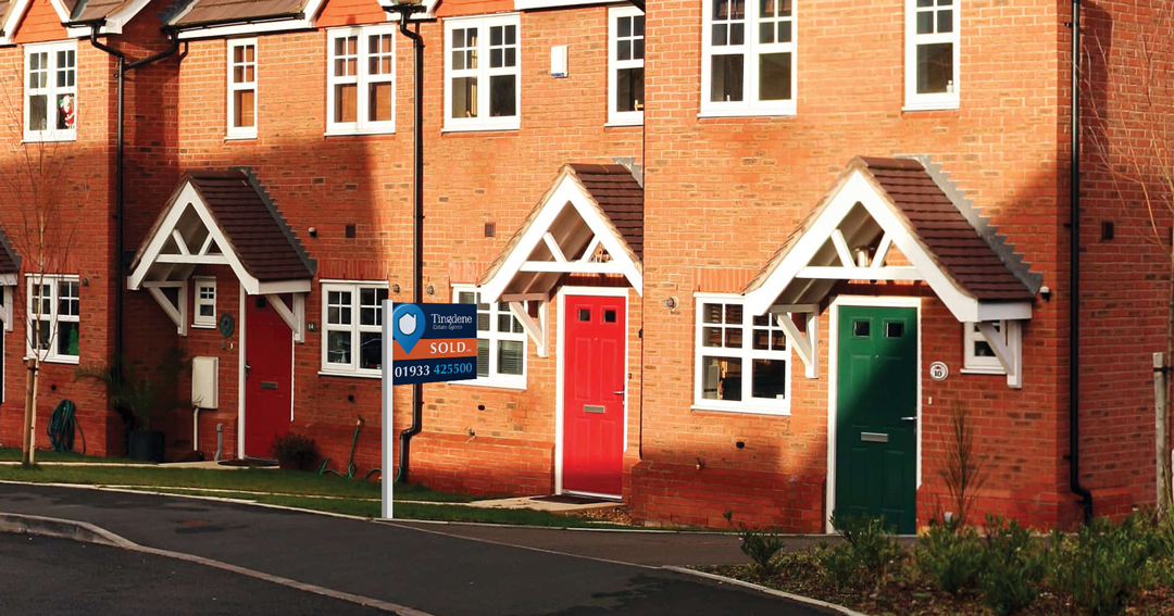
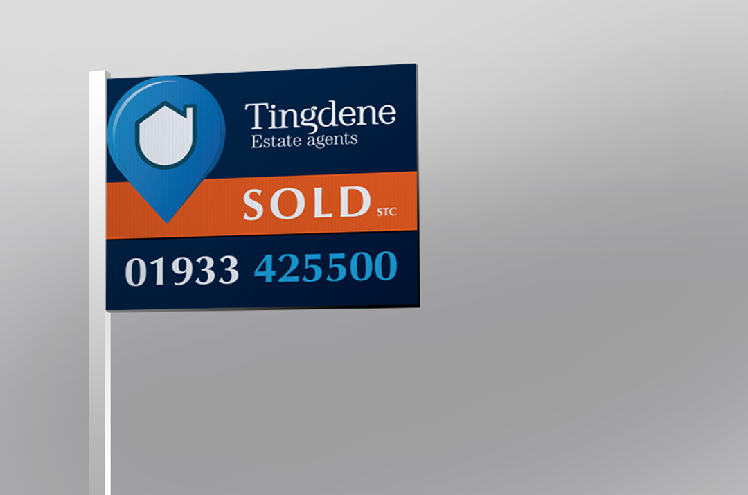
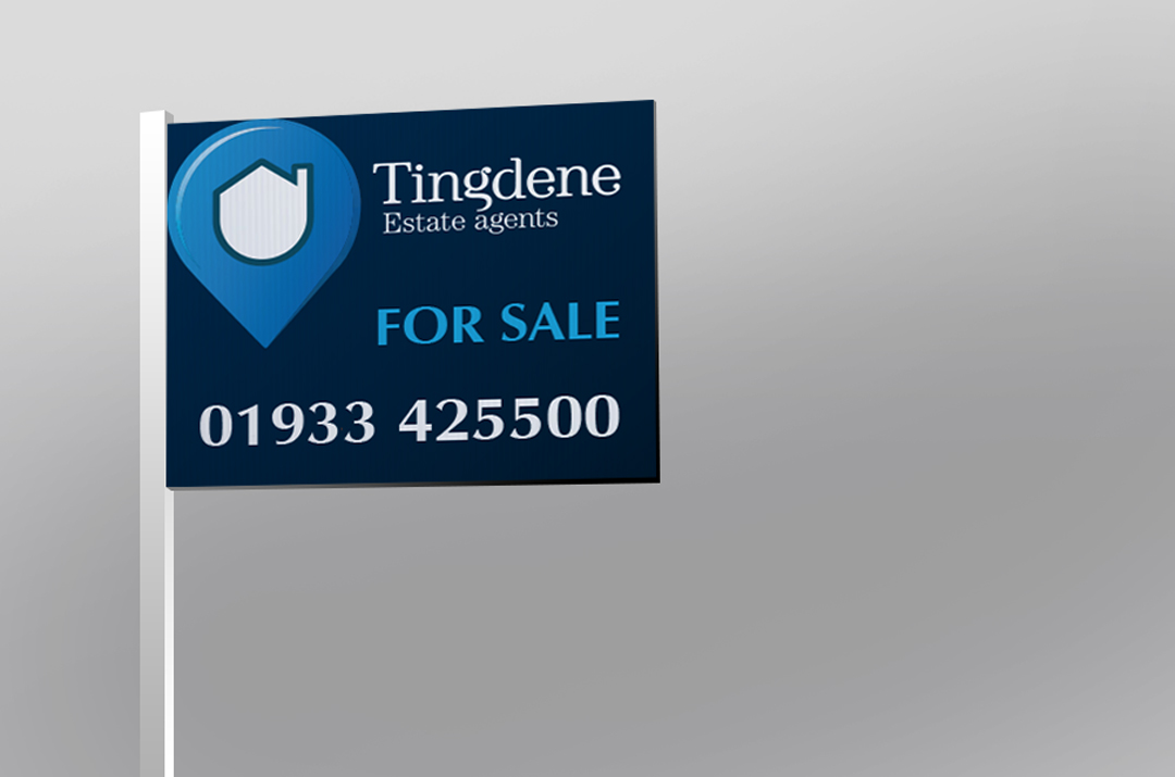
With the regional property market booming through the pandemic, Northamptonshire based Tingdene Estate Agents decided it was the right time to give their existing ‘For Sale’ and ‘Sold’ property boards a fresh look and feel with a redesign. Deciding to step away from their mostly white borads, we introduced a dark blue concets with a vibrant orange sold slip to help the company’s success stand out in a crowded market.
A redesign of boards is more than simply putting a logo and a phone number in place, the size is restricted by local authorities (o.5sqm for residential and 2.0sqm for commercial), the board has to stand out and the design has to be clean enough that a passing motorist will remember the agents name. Not only that, but the board has to look good… nobody wants a shabby board putside their hour for 14 days after moving in (yep – that’s how long agents are permitted to leave the board there before they are required to remove it, find out more here).
We’re really pleased with the redesign of the boards and the agent was delighted with them too – a standard we aim to set with every project, no matter how big or small. If you’re thinking of rebranding or updating your existing brand, don’t hesitate to get in touch today.
We made a campaign last year for Tingdene advertising both sides of their estate and letting agency business, see it here.


